Ethereal brand identity for Rutland Water Nature Reserve
By Guest 11th Jun 2019



Rutland Water Nature Reserve recently commissioned Sarah Hatherill, of Langham's Well Street Studio, to design a brand identity for the Rutland Osprey Project merchandise.
The osprey in question (the Rutland version!) is a pretty impressive bird of prey which migrates to Rutland Water Nature Reserve every year from Africa to breed.
The osprey project team briefed Sarah and told her that a drawing of the Rutland Osprey would 'not be enough to capture the imagination of their discerning audience'.
They tasked her with coming up with a 'cool' identity, which could be used on product to raise some much needed cash for this hard-working charity.
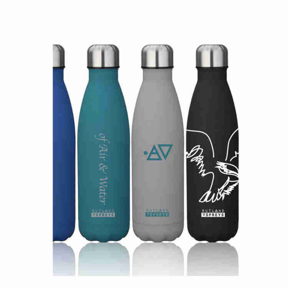
The ancient symbols for air and water were developed as the main brand identity because the Osprey is literally 'of air and water'; the bird flies 1000's of miles between Africa and the UK to breed and raise its chicks, barely touching land on this incredible voyage.
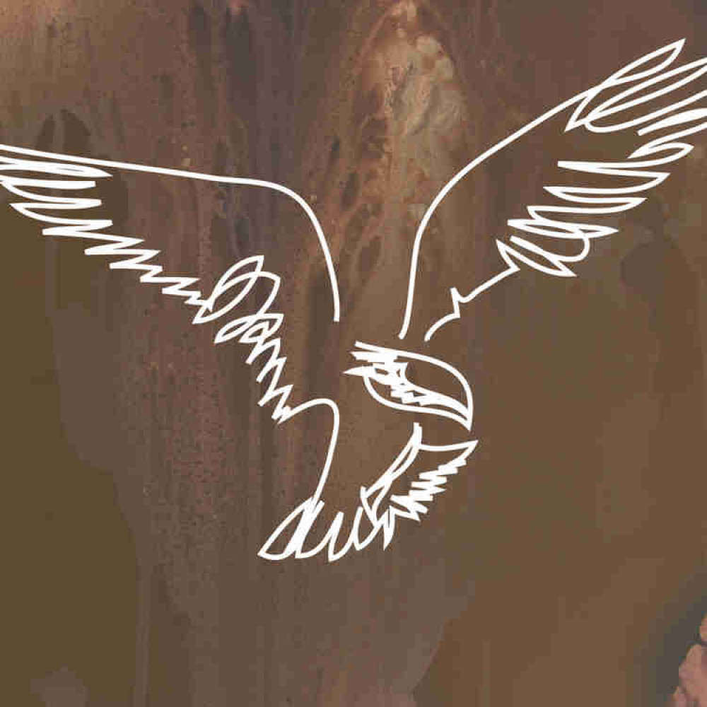
Although Sarah had been told not to use a drawing of the bird it was felt that an iPad drawing she did as part of her reference work was particularly strong and so it was used to enhance the graphic brand identity.
The other designs have been printed onto a series of t-shirts and drinking bottles for sale in the shop at Rutland Water.
The Rutland Osprey Project is important, without the Rutland Osprey volunteers this magnificent bird would now be almost extinct in the UK.
You can see the Rutland Osprey Project merchandise designs and this magnificent creature in the flesh at Rutland Water Lyndon Bird Watching Centre. Visit the website at https://www.lrwt.org.uk.
CHECK OUT OUR Jobs Section HERE!
oakham vacancies updated hourly!
Click here to see more: oakham jobs
Share:


